This is our downstairs bathroom. I did paint this a neutral color. The owners had it some awful brown color and even the cabinets were painted the same color of brown. It all blended together and just looked awful. I painted the cabinets white and I think it helped some. It works for now and opens the space up instead of being so dark.

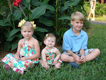
That sweet picture is of my smallest child and my husband a month or so ago. I love it. The Wash sign I saw on another blog Craft-O-Manic in her laundry room. I decided just to do one for the bathroom. It didn't turn out nowhere near as cute as her's.

This is the girls bathroom and it's very bare. It has wallpaper as does our master bath. I had originally thought of asking if I could take it down or pay someone to but then I thought I didn't want to waste my money on something that's not mine. It's not as bad to me as our master bath wallpaper. I want a window treatment for that window because it's long but I haven't done it yet.

The counter area

This is Dawson's bath/Guest Bath/Playroom bath.

I won this cute sign in a giveaway a couple of months ago and love it.
This is walking into our bathroom and that's all I'm showing of that bathroom. Ha. The wallpaper makes it way to busy. We have a huge counter space area and a huge bath and shower which is great.
Thanks for visiting.


.JPG)


4 comments:
You have a cute blog. Your bathrooms are decorated really sweet. I love the little lamps. Thanks for giving me a peek.
http://thenefffamily4.blogspot.com
I didn't think it was bad (the wallpaper) until you got to your bathroom. HEE! HEE!
You are right, don't waste your money on something that you will not be living in after a while.
I think that you have done a great job with what you have! I kid about the wallpaper. It isn't that bad.
I love the "WASH" sign you made. It looks fantastic :)
Raychel
I love your bird shower curtain!
Post a Comment